Exhibitions

The Imperial War Museum finds a deadly place to display first world war masterpieces

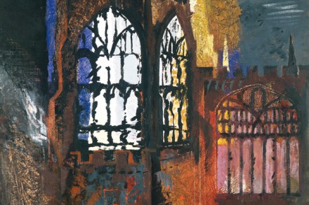
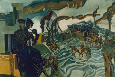
The Imperial War Museum has reopened after a major refit and looks pretty dapper, even though it was overrun by hordes when I visited (it was still the school holidays). There’s a new and effective restaurant, inevitably, but also a new sense of spaciousness. I am not concerned here with weapons of mass destruction, merely with the record of the damage they inflict. They keep the art up on the third floor of the museum, and currently have a major display devoted to the first world war, which they claim is the largest of its type for nearly a century. It’s full of expected names, shown in some detail. But the ambience is wrong: there is something utterly deadly about those third-floor galleries (appropriate in a war museum, I suppose), which kills exhibitions stone-dead.
The Bloomsbury painters bore me

Virginia Woolf (1882–1941) claimed that nothing has really happened until it has been recorded, so this new exhibition at the NPG devoted to her life can only now be said to have happened — for here I am recording it. Of course it is a truism that an exhibition only exists while it is on. Afterwards it remains in (some of) the memories of those people who visited it, and in photographic records or a catalogue of the exhibits.

Agitprop, love trucks and leaflet bombs: the art of protest

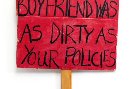
Titles can be misleading, and in case you have visions of microwave ovens running amok or washing machines crunching up the parquet, be reassured — or disappointed. Disobedient Objects, the new free display in the V&A’s Porter Gallery, is about objects as tools of social change. It’s a highly politicised exhibition and contains a great deal of fascinating material, from films to how-to guides (not quite ‘how to make a bomb’, but nearly). The gallery was packed when I went along. An admission charge might have made a difference. However, this is the kind of exhibition that should be free in a democratic country — if only to remind as many of us as possible what repressive regimes elsewhere impose on their luckless populations.

Futurism’s escape to the country

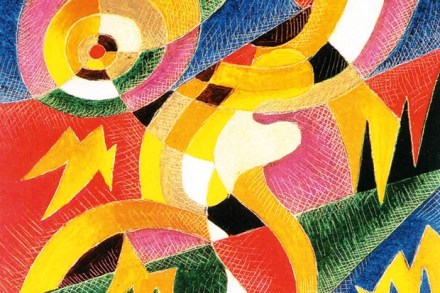
Futurism, with its populist mix of explosive rhetoric (burn all the museums!) and resolutely urban experience and emphasis on speed, was a force to be reckoned with (at least in Italy) for longer than one might imagine. It was launched in Paris in 1909 by Filippo Tommaso Marinetti, poet and performer, a superb propagandist for the movement he effectively founded, and it managed to survive the upheavals of the first world war, continuing into the 1920s. (Some say it lasted until Marinetti’s death in 1944.) Besides the core figures of Boccioni, Carrà, Balla and Severini, there were a number of other artists closely involved in Futurism, one of whom was Gerardo Dottori (1884–1977).

The perfect excuse to get out all the best Ravilious china

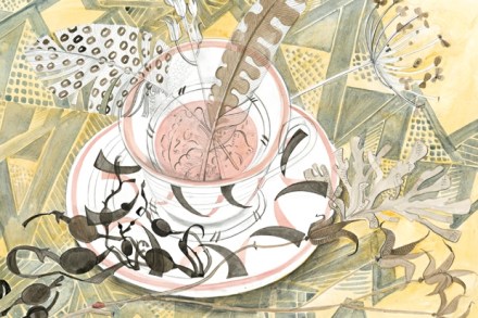
A day trip to the Towner Art Gallery in Eastbourne is a summer pleasure, and two concurrent shows are proving a considerable draw, with their focus on design and applied art. Designing the Everyday is in some ways just an excuse to get out all the best Ravilious china and show it with his working drawings, but where’s the harm in that? Ravilious continues to be one of the most popular of 20th-century British artists, and his applied art is not as well known as his pellucid watercolours, so here’s a chance to remedy that. And to put it in context, the surrounding rooms examine work from both earlier and later periods: a light-hearted and enjoyable selection by guest curator Nathaniel Hepburn.

How Richard Wilson made Wales beautiful

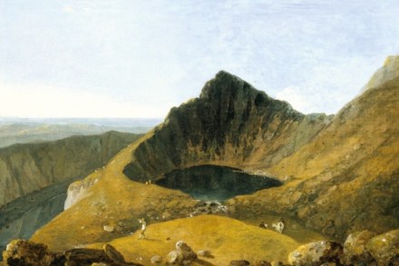
‘I recollect nothing so much as a solemn — bright — warm — fresh landscape by Wilson, which swims in my brain like a delicious dream,’ wrote Constable of his encounter with the Welsh artist’s ‘Tabley House, Cheshire’ after he visited the gallery of that house owned by Sir John Leicester. Recalling this epiphany, Constable went on to say of Richard Wilson: ‘He was one of the great appointments to shew to the world what exists in nature but which was not known till his time.

A lost opportunity to show John Nash at his best

John Northcote Nash (1893–1977) was the younger brother of Paul Nash (1889–1946), and has been long overshadowed by Paul, though they started their careers on a relatively even footing. The crucible of WW1 changed them: afterwards Paul became an art-world figure, cultivating possible patrons, quietly forceful and ambitious, deeply involved in the theory and practice of Modernism. John retreated into his love of nature (in particular gardening and fishing) but continued to paint with an almost classical refinement and orderliness. His art stayed close to nature yet stood back from it, while the Romantic Paul was consciously experimental, adopting a poetic approach that was unexpectedly graphic until the great paintings of his final years.

Why did it take so long to recognise the worth of British folk art?

British folk art has been shamefully neglected in the land of its origin, as if the popular handiwork of past generations is an embarrassment to our cultural gurus and the kind of supposedly hip commentators who sneer at morris dancing. Last May I reviewed the archive display at the Whitechapel Gallery of Black Eyes and Lemonade, which re-visited the 1951 Whitechapel exhibition of the same name, a survey of vernacular art in Britain curated by the artist Barbara Jones; but that show, more than 60 years ago now, was probably the only specifically folk art exhibition in a major museum or public gallery to take place in recent years.

Malevich: Are Tate visitors ready for this master of modernism?

Kazimir Malevich (1879–1935) is one of the founding fathers of Modernism, and as such entirely deserves the in-depth treatment with which this massive new Tate show honours him. But it should be recognised from the start that this is a difficult exhibition, making serious intellectual and emotional demands on visitors, as art enters the realm of pure thought, utterly divorced from the comforting world of appearances. Malevich was one of the first great revolutionary practitioners of abstract art, a pioneer who made work of singular beauty and resonance, but his path is not always easy to follow. Perhaps with this in mind, the exhibition starts with a room of early, mostly figurative work, in which Malevich is shown experimenting with different ways of depicting.

Had Hollywood not lured him away, Dennis Hopper could have made his name as a photographer

In an age when photographs have swollen out of all proportion to their significance, and are mounted on wall-sized light boxes the better to show off their high-resolution colour, it’s a relief to see an exhibition of small photographic prints in good old black and white. Dennis Hopper (1936–2010) is best known as an actor and hell-raiser, but he was also an artist who worked in various media. ‘I am an Abstract Expressionist and an Action Painter by nature,’ he insisted, but in the Sixties he took thousands of photographs, a group of 400 of which are now on display in the Academy’s Burlington Gardens galleries. Because they are relatively small, they are arranged in blocks on the walls of these spacious rooms.

Painted, sculpted and stuffed: a history of the bird in art

These days, as the sparrows and starlings so common in my youth are growing scarce, there’s less need for a rarity like the osprey or butcher bird (the red-backed shrike) to raise awareness of the plight of birds, and with Radio 4’s Tweet of the Day you might say that birds are in (or on) the air — but then they would be. The flightless varieties, such as the dodo, have always been in greater danger, unless they could run very fast. Birds are synonymous with flight, and as such are a potent symbol and embodiment of many of humanity’s hopes and dreams. They connote both the human and the divine spirit through their soaring freedom of movement, and their linking of earth and sky (often also water).

Charles Hadcock – taking on the age of speculation with sculpture in the City

As the boundary between auction house and art dealer blurs yet further, with auctioneers acting increasingly by private treaty as well as taking over commercial galleries, and as West End gallery space becomes ever more expensive, alternative exhibiting venues are being sought with growing urgency. One solution is to move further into corporate territory, and Charles Hadcock (born 1965) is currently doing just that with an exhibition of his latest sculptures in the foyer of 60 Threadneedle Street in the City.

Oceans and forests in kaleidoscopic flow – discovering Keith Grant

For decades I’ve been aware of the work of Keith Grant (born 1930), but it is only in recent years that I have come to know it at all well. During that time both the style and the subject of his paintings have undergone a series of remarkable revolutions, as he determined not to rest on his laurels, but to explore the fundamentals of his approach and interests. You don’t often see an artist doing this, particularly one over the age of 80, when an ‘everything goes’ Old Age Style is a more common development.

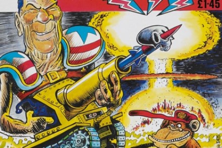
A comic drawn by Bob Monkhouse in which a superhero battles giant penises? Yes, it’s all here

Fwoooosh! That, were someone to write a strip about it, would be the sound of a thousand comic books going up in flames. They used to do that, you know; burn comics. It was mostly in America, in the late 1940s, after these DayGlo fictions, with their monsters and superheroes and suggestive curves, were declared bad for children’s health. But it spread to Britain too. Parents and teachers would search drawers and desks. Any comics they found would be gathered in small piles outside. A responsible adult would pull out some matches. And then, like I said: fwoooosh! Of course, comics are now treated with greater respect.

The painter who channelled the forces of gravity

Tragically, Ian Welsh (1944–2014) did not live to see this exhibition of his latest work. Diagnosed with terminal cancer on the eve of his 70th birthday, he struggled to finish the two large paintings in his last series of works, entitled ‘Gravity’s Rainbow’. He found it increasingly difficult to stand to paint, but he worked, sitting down instead, on a group of six small canvases that have a mysterious linear assurance worthy of the best of late de Kooning. Welsh desperately wanted to see his new work up on the refurbished walls of his local gallery, Hasting Arts Forum, of which he was a passionate supporter, acting as chairman until very recently. But despite his fortitude and remarkable good spirits, he died just three weeks before the exhibition opened.

The Royal Academy Summer Exhibition offers up the good, the bad and the ugly – and a sore neck

One of the great traditions of the RA’s Summer Exhibition has always been that each work submitted was seen in person by the Hanging Committee, passed in front of their keen or bemused gaze by a succession of porters. Of course this method had its drawbacks: judges could miss something in a state of postprandial somnolence induced by the consumption of too much (heavily fortified) beef tea, but at least the paintings, drawings and prints had a chance of being chosen through that all-important direct communication of eye and art. (Sculpture, because of its scale and mass, has always presented its own logistical problems.) This year, for the first time, artists submitted their works digitally for the initial round of judging. Has this made any appreciable difference? Not really.

When Mondrian was off the grid

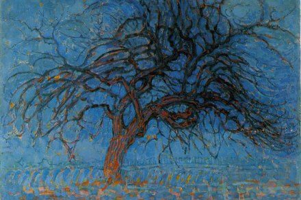
I find it easy to forget that Piet Mondrian is a Dutch artist. The linear, gridlocked works he is famed for seem to beat with the energy of the New York metropolis. But it was not always so. His path to abstraction was a precarious one that bumped into a number of styles drifting round during the early 20th century. And, in the beginning, his work was Dutch — pastoral, domestic, earthy. To see this progression, head to Margate (Margate!) where you will find an exhibition of Mondrian’s work at Turner Contemporary, which commemorates the 70th anniversary of his death. The title sounds generic — Mondrian and Colour (artist — tick! Artistic property — tick!) — but in many ways, it’s confusing.

It took 11 years to bring Bill Viola to St Paul’s Cathedral – but it was worth it

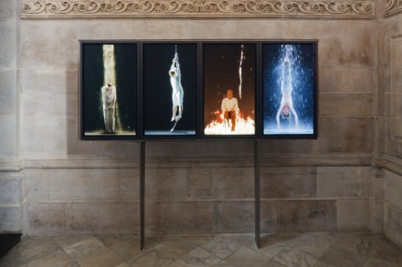
Deans are a strange breed. Growing up in the Church of England, I met a wide range, their cultural tastes embracing everything from Chagall to In Bed with Madonna. In 2003, I didn’t know what appealed to the then Dean of St Paul’s Cathedral, John Moses, but in April of that year it suddenly became crucial. I was proposing that St Paul’s commission the artist Bill Viola — dubbed by some the Rembrandt of the video age — to create a work for the cathedral. Since Moses had never heard of Viola and I didn’t work in the visual-arts world, it seemed a far-fetched proposition. Yet I was in no doubt that it should happen.

Kenneth Clark wasn’t happy simply popularising art, he liked to collect it and shape it too

Earlier this year, I sat down and watched Kenneth Clark’s groundbreaking TV series Civilisation. I vaguely remember when it was first screened in 1969, but was too young to appreciate it properly. This time around it made splendid Sunday afternoon viewing: Clark’s distinctive blend of authority and humour, his ability to convey information and enthusiasm without the slightest trace of condescension, coupled with effective camerawork and good editing, make a rich and stimulating brew of word, image and music. The series, which was commissioned by David Attenborough and brilliantly directed by Michael Gill, established a model for all subsequent arts documentaries. Not only did I learn a lot from its 13 episodes, I also enjoyed it enormously as entertainment.

Can Lynn Chadwick finally escape the 1950?

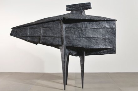
Lynn Chadwick was born 100 years ago in London, and died in 2003 at his Gloucestershire home, Lypiatt Park, where he is buried in the Pinetum. He was one of the great names of 20th-century sculpture, not just in England but recognised and celebrated internationally, too. He first came to prominence in the 1950s, and the aura of that decade clung to him for the remainder of his career. He was included in the 1952 Venice Biennale with seven other sculptors (including Kenneth Armitage, Reg Butler and Eduardo Paolozzi), when Herbert Read coined the phrase ‘geometry of fear’ to describe their work. In conjuring up this postwar angst, Read spoke of an ‘iconography of despair’ and ‘collective guilt’.