Interior design

Farrow & Ball is finished

From our UK edition

In PR terms, it’s a such a well-worn trajectory, it has its own name. ‘Doing a Burberry’ is the term for when something once exclusive and favoured by those in-the-know is appropriated by the hoi polloi and its standing slips inexorably downwards. The Ivy — now a chain of naff provincial cafés — is a notable victim. Marbella, now ‘Marbs’ thanks to the cast of TOWIE is another. So is the name Samantha, once terribly Sloaney, now associated only with a former page 3 girl and some really filthy double entendres on I’m Sorry I Haven’t a Clue on Radio 4.

The art of dining

From our UK edition

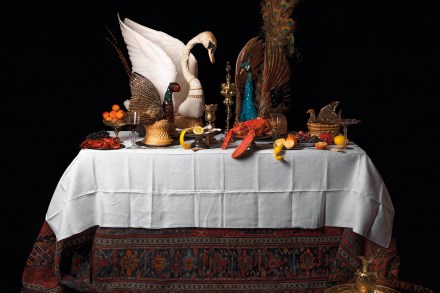
Ivan Day pulls out an old Habsburg cookbook from his library. The 300-year-old volume is so thick it’s almost a perfect cube, and by some miracle the spine remains intact as he opens it. ‘It’s like a big Harry Potter spellbook,’ he jokes while flicking through drawings of pastry baked in the shapes of dolphins, tortoises, pelicans and griffins. I recognise one design from the half-eaten pie in his kitchen: a cross between a soup tureen and an embroidered throw pillow. Ivan is a curator, self-trained cook and Britain’s premier historian of food.

Could AI lead to a revival of decorative beauty?

From our UK edition

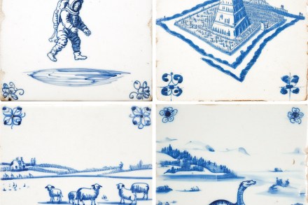
In front of me is what appears to be an authentic Delft tile. The surface of the tile is mottled, and painted on to it is a picture of a man. The blue tones blur and fade into the edges. Delicate brush strokes are visible if you peer closely. It looks as though it were made many years ago. Except it wasn’t. It was designed this morning by artificial intelligence and created in a small factory near Stoke-on-Trent, using some of the most advanced printing technology available. ‘Josiah Wedgwood would have loved what we are doing… I suspect William Morris would have hated it,’ says Adam Davies, the co-founder of the company creating these tiles.

What will the ‘Colors of the Year’ be in 2024?

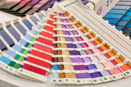
As we enter 2024 with trepidation, let us take comfort in the fact that this year’s “Colors of the Year” are actual colors. I’m an interior-design enthusiast who takes color very seriously. Over the course of seven years, I agonized over narrowing down dozens of saved paint samples to just five shades with which to paint the walls of a hypothetical cabin. Monet and I are simpatico — color is our “day-long obsession, joy and torment.” The online algorithms are well aware of my interest in interior decorating ideas, which may explain my impression that paint manufacturers put out a new “Color of the Year” every couple of months.

colors

Kamala Harris’s home aesthetic is as charming as a Super 8 hotel room

Nothing says “you have a fantastic sense of style!” quite like... your choices offer “a valuable lesson in color trends.” Cockburn can’t imagine what Mrs. Cockburn’s reaction would be if he said that about her eveningwear, yet that’s the best Homes & Gardens could come up with in describing the “controversial” paint colors Kamala Harris chose for the interior of her official residence. Harris’s Number One Observatory Circle home is full of “anti-fashion” gray hues, explains the publication, with the open-place space boasting “a strikingly gray color palette — from the painted walls to the drapes, dining chairs, and large rug atop the wood floor.”   In other words, the vice president’s domicile is drab AF.

kamala harris style aesthetic

The best podcasts where girls sit around talking about ghosts

From our UK edition

‘I’ve actually seen ghosts.’ This statement comes less than ten minutes into the first episode of Dark House, a limited-series podcast about ghosts, houses and interior decoration from House Beautiful magazine. And this is the moment, I assume, a certain number of people roll their eyes and switch over to the next podcast in their queue. Humans are fascinated by ghosts. We tell the stories, we take the city tours of hauntings when we travel, we see all the films in the Conjuring and Insidious series. But that’s a bit different from seeing real ghosts, which is just someone taking things too far. It was a shadow, or a dream, or a trick of the light, or a flaw with the camera.

Deserves to be much better known: Sophie Taeuber-Arp at Tate Modern reviewed

From our UK edition

Great Swiss artists, like famous Belgians, might seem to be an amusingly underpopulated category. Actually, as with celebrated Flemings and Walloons, when you start counting you discover there are more of them than you thought. Paul Klee, for example, and Alberto Giacometti. A third, whose work is reassessed in a large exhibition at Tate Modern, was Sophie Taeuber-Arp. Clearly, unlike the other two, hers is far from being a household name even in fairly artistic homes. There are several reasons for this, one perhaps being the unwieldiness of that cognomen itself. She was born Sophie Henriette Gertrud Taeuber in 1889 at Davos, and as was then the custom, hyphenated her surname with her husband’s when she married Hans (or Jean) Arp in 1922.

How will Carrie cope with the hideousness of Chequers?

From our UK edition

Zut alors! The court of King Boris gets more like Versailles each day. With some talcum powder on that ramshackle hair, the Prime Minister would be the image of Louis le Something after a night on the Tuileries. His government, meanwhile, totters towards the tumbrils. Le Marquis d’Ancock, Comte de Raab and Le Petit-Maître Gove all cower in the corridors of power, fearful of ‘À la Bastille!’ being barked by sitting pretty Mme de Patel, or a strictly formal dressing-down from His Holiness, L’Abbé Rees-Mogg. Behind the screens, Madame du Carrie ponders eco-friendly lightbulbs with Mlle Lulu, or the source of the handwoven rattan for that dog’s basket.

The curious rise of cottagecore

From our UK edition

Cottagecore, not to be confused with cottaging, is an aspirational lifestyle trend. The word is relatively new —although you’ll find it used all over TikTok — but the idea isn’t. If you have ever dreamt of leaving behind the urban sprawl for something more bucolic, or donned a cheesecloth dress and flower crown in the hope that it will make you seem a little folksy, you’ll understand the aesthetic. Cottagecore is the eternal search for a pastoral idyll, updated for the Instagram generation. It is hardly surprising that such a romantic movement has been revived during a time of pestilence and isolation. Throughout the pandemic, many of us have felt as though we aren’t exactly living our #bestlife.

The rise of blocked-off design

From our UK edition

Plexiglass bubbles hover over diners’ heads in restaurants. Plastic pods, spaced six feet apart, separate weightlifters in gyms. Partitions of all kinds are creeping up in workplaces. As offices, restaurants, bars and businesses reopened after months of lockdowns and closures, a new phenomenon emerged, one that I’ve come to think of as ‘blocked-off design’. It’s design and layout that aims to construct and enforce distancing in a somewhat makeshift way. It’s characterised by partitions, sheer walls, six-foot markers. As a visual language, it’s defined by barriers and blockage — physical reminders that spaces where we once went to mingle with others are now fraught, and that even in public, isolation is necessary.