In PR terms, it’s a such a well-worn trajectory, it has its own name. ‘Doing a Burberry’ is the term for when something once exclusive and favoured by those in-the-know is appropriated by the hoi polloi and its standing slips inexorably downwards. The Ivy — now a chain of naff provincial cafés — is a notable victim. Marbella, now ‘Marbs’ thanks to the cast of TOWIE is another. So is the name Samantha, once terribly Sloaney, now associated only with a former page 3 girl and some really filthy double entendres on I’m Sorry I Haven’t a Clue on Radio 4.

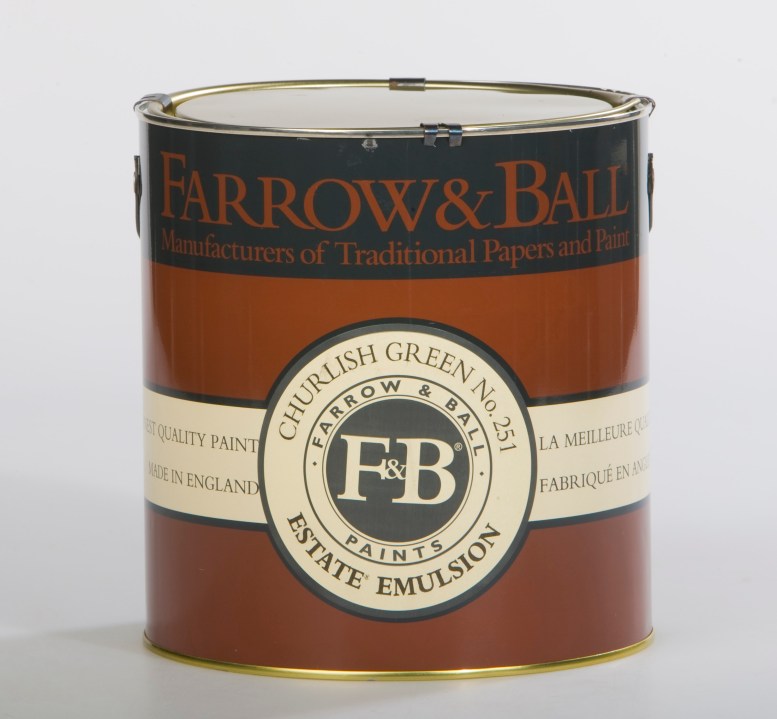
And now Farrow & Ball (F&B), purveyor of sludge-coloured paints to the upper-middle classes since 1946, is going the same way. For decades, couples called Jemima and Hugo slapped colours with daft names like ‘Dead Salmon’ or ‘Clunch’ on the walls of chilly old rectories — or, rather, got their builders to do it. Decorators, of course, grumbled like mad because the water-based paints are a pain to work with, unlike good old vinyl emulsion, which is so beastly for the environment.
It was the ultimate good-taste flex with a reassuringly expensive price tag. (A five-litre tin of F&B emulsion costs around £100, compared with £38 for the same amount of Dulux down B&Q — though, granted, you don’t get a choice of 97 shades of off-white with the bog-standard high street brands.) Slosh the Farrow & Ball around and superiority and smugness were guaranteed. Remember David Cameron sitting on the steps of his shepherd’s hut after leaving No. 10? The wagon was painted ‘Mouse’s Back’: an F&B ‘grey-brown classic’, according to its website. As for those pink, slappable cheeks? They were almost a new F&B colour in themselves. ‘Bullingdon Boy’, perhaps, or ‘Referendum’?
For years, skips full of F&B’s empty brown and yellow paint pots were a sign that an area was on the up. Here I must hold up my hand. When I did up my first house in Brixton 15 years ago, Ros Byam Shaw’s Farrow & Ball: Living with Colour was my bible. My front door was painted in the deep grey ‘Railings’, the bathroom in ‘Oxford Stone’, kitchen walls ‘Pale Hound’, cupboards in ‘Pigeon’.
In fact, it’s ‘Pigeon’ to which I attribute Farrow & Ball’s downfall. Drive around the Cotswolds, the Cornish coast or my new manor of north Norfolk and the cottages colonised by the DFLs (the Down From Londons) are immediately identifiable by the window and doorframes painted in this curious green-grey. It’s all over the woodwork of Daylesford Organic, Soho Farmhouse and every aspirational farm shop from here to Herefordshire. Out goes the vernacular pigments (round me, it seems to be a deep blue, somewhere between royal and navy) and in comes what John Betjeman would have termed ‘Ghastly Good Taste’.
For years, skips full of F&B’s empty brown and yellow paint pots were a sign that an area was on the up
Blame Dulux for offering Farrow & Ball colour-matching, but ‘Pigeon’ is now so ubiquitous that even the new-builds on the edge of my village with their blank double-glazed windows come with uPVC frames in an approximation of this shade.
I’ve deliberately left my peeling windows in the grotty Custard Cream colour they were painted by the previous owners (we’ve gleaned from various tradesmen that they were far too tight to have bought Farrow & Ball). This is a good thing, I think.
Since reading that Emma Burns of Colefax and Fowler uses ‘Jabot White’ by Dulux on ceilings, I’ve done the same, saving hundreds of pounds. My neighbours who own all the land around us use trade off-white in the hall and in all the estate properties.
If you want to use ‘heritage’ paints that will make your friends envious and your builders hate you, then an interior designer pal advises that ‘Edward Bulmer is posher’. Granted, the names of his paints are less distinctive than F&B (though he does have a belter in ‘Cuisse de nymphe emue’, a dusky pink, which, if you failed A-level French, translates as ‘thigh of an aroused nymph’.)
Designers who really want to stick it to the aspirational middle classes opt for Paint & Paper Library (which just uses numbers for its colours) but rarely Farrow & Ball these days. The beleaguered brand even featured on one of the ‘Things Nicky Haslam Finds Common’ tea towels. They’ve become, Haslam has said, the Laura Ashley of our times.
But what next for the company? It’s a long time since Farrow & Ball was a truly quirky British artisan business, with founders John Farrow and Richard Ball (a chemist) tinkering around in a shed in Dorset. They sold up in the 1960s; in 2014 an American private equity group bought the company, selling it for half a billion dollars to a Danish paint firm seven years later. But profits fell following the collapse of the DIY chain Homebase in 2024, a big chunk of F&B’s customer base — showing just how mass-market they’d become.
Maybe it’s time to whack up the price to try to claw back that old exclusivity. Clients who pay £400 for a metre of Robert Kime fabric won’t blanch at £200 for a pot of paint. And F&B’s paints are still made in the West Country rather than a Chinese death camp — so let’s double down on those English eccentricities, which means even more ridiculous names reflecting our great nation. I’ve come up with a few while I’ve been writing. How about ‘Le vice anglais’, a bruising red purple, ‘Gammon’, a florid deep pink, and ‘Stop the Boats’, a glossy black the deep shade of a rubber dinghy for starters. You’re welcome, Farrow & Ball. My invoice is in the post.


Comments