
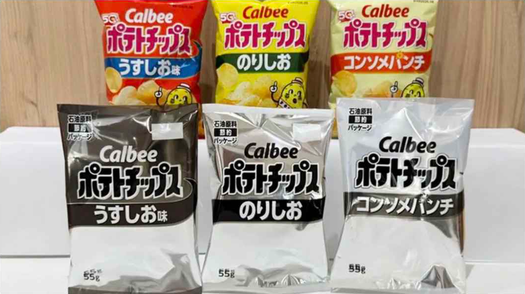
The conflict in Iran is having serious knock-on effects around the world, from cancelled flights as jet fuel supplies run short to fears about the food supply as fertiliser prices increase. Japan, which gets 90 per cent of its oil from the Middle East, is as vulnerable as anyone, but the most serious consequence there, according to much of the local media at least, is the prospect of a Naptha drought. Naphtha (‘nafusa’ is the Japanese pronunciation) is the petroleum-derived chemical used, amongst other things, for the vivid colours used in food packaging.
On 12 May, Calbee – the company that makes Japan’s most popular brand of potato crisps – announced that, in response to a 79 per cent increase in the price of naphtha, its distinctive orange packaging would be replaced by a funereal monochrome for its lightly salted, consommé and seaweed salt flavoured snacks. Then, a week ago, Kagome, the company that produces a popular brand of ketchup, announced a redesign of its packaging, with half the colourful label removed. The company explained that a substitute for the petroleum-based ink used in the ketchup bottles could not be found, so much smaller labels would be used.
Japan is a nation of colour synaesthetes
Cue panic stations in Japan. A Kyodo poll revealed that 70 per cent of Japanese are concerned about ‘nafusa’ running out. The Japanese government, whose popularity appears to have dipped slightly in the wake of the naphtha panic, was forced to issue a reassuring statement that sufficient stocks of oil-derived plastic products have been acquired for the time being. Less attention has been paid to reports that Japan’s two major airlines have raised their prices amidst fears of a jet fuel crisis, or indeed that prices have been rising across the board – including those of potato crisps.

Why is this such a big story? Possibly because Japan is a nation of colour synaesthetes (people for whom colour triggers special sensory perceptions). Colour plays a central role in the setting of the national mood. Across the country, following exhausting workdays, the Japanese slump in front of their TV sets (perhaps munching some vividly-packaged seaweed-flavoured potato crisps) and are somewhat revived by the inane TV panel shows whose only redeeming feature is the riot of colour on display. It’s a form of national colour therapy.
Every colour has a meaning and resonance, often derived from ancient Shinto rituals and Japan’s obsession with seasonality. Red is seen as propitious (Liverpool are the most popular Premier League team, simply because they play in all red), white is sacred, green and blue (interchangeable to the Japanese) represent nature, pink renewal, and so on.
There are even believed to be – somewhat preciously perhaps – special, subtle ‘Japanese colours’ (‘dentoshoku’) which, according to the Kyoto handicraft centre website are rooted in the seasons and ‘do not shout but whisper, inviting use to look closer’. Colour, it claims, ‘is never random. It is a quiet dialogue between artisan, material, and spirit’.
Subtle gradual changes in colour are also celebrated, almost worshipped, as witnessed by the annual frenzy over the ‘koyo’ – or the changing colours of the leaves, which has inspired artists for centuries and draws huge numbers of domestic tourists to the most gloriously vivid areas (the gardens of and woods around Kyoto). Like the fabled blooming of the cherry blossoms, the Japanese have the child-like ability to greet these entirely predictable annual chromatic phenomena with awe, as if experiencing them for the first, and possibly last time.
The sudden absence of colour then, even on something as mundane as a packet of potato crisps, is disturbing. It disrupts the natural order of things and signals an abrupt shift in mood from the realm of the senses to that of the work space (typically drab, cramped colourless spaces, where nothing is permitted to distract staff from their duties). There are even grimmer associations: ‘It makes me think of the second world war’ said one Japanese friend.
The foreign reaction to all this has been quite interesting. The message boards have been full of ‘gaijin’ collectively rolling their eyes or even celebrating the news that packaging will be blanched and simplified. ‘There is too much damn packaging anyway’ says on typical post, a reference to the often frustratingly meticulous way each individual good in Japanese shops is given its own often wholly unnecessary wrapping, taking up time at the check-out and making unpacking goods at home a chore.
Some are even suggesting the whole thing is fake. Ink prices may have gone up, but is a wholesale redesign necessary? Could it even be a marketing ploy? The distinctive black and white (or ‘white and black’ as the Japanese say) potato crisps packets may be depressing, but they are already acquiring a rarity value akin to misprinted stamps or limited-edition singles from famous bands. Nobody knows how long this will last so they have a novelty value.
If it boosts sales, it will be an amusing tribute to the endless ingenuity of Japanese marketing. The Spectator’s Wiki man, advertising guru Rory Sutherland, would be impressed.





Comments